The homepage — it’s the gateway to our online universe, our first handshake with virtual visitors, and undeniably the beating heart of any website. It’s that familiar place we return to, the cornerstone that anchors us as we embark on our digital voyages. It’s our brand’s introduction, our business’s front porch, and at times, the culmination of our online identity.
As we dive into the wonderful world of homepages, buckle up! We’ll unravel the threads of creativity, design, user experience, and marketing psychology that intertwine to make a homepage not just a static page, but a dynamic journey that reflects the soul of a brand.
So, whether you’re a seasoned webmaster, a budding entrepreneur, or just curious about web design, let’s embark together on this exploration of homepages. After all, isn’t every great adventure initiated with a single, welcoming ‘home’ to start from?
Understanding Your Audience

Before we delve into the nuts and bolts of design, it’s important to get one thing straight: your audience is the beating heart of your website. If you don’t truly understand who you’re designing for, it’s like trying to hit a bullseye in the dark; your chances of creating a homepage that truly clicks with your visitors are slim.
Identifying Your Target Audience
Who are your users? This seemingly simple question has layers. Beyond basic demographics like age, gender, and location, you should consider their interests and goals. What problems are they trying to solve? What kind of content are they looking for? Use tools like Google Analytics and audience surveys to gather this data and create detailed user personas.
Understanding User Expectations
In the digital age, users have come to expect certain standards. They want the information to be easily accessible. They want a navigation system that’s intuitive and user-friendly. And of course, they want a website that looks professional and appealing. You can glean insights into these expectations by studying user behavior, doing competitor research, and collecting user feedback.
Essential Elements of a Homepage

Crafting a powerful homepage isn’t just about tossing a bunch of elements together. It’s more like a well-rehearsed orchestra where every instrument plays its part. Each element, whether it’s your logo or navigation menu, plays a crucial role in drawing in your audience, conveying your brand’s personality, and guiding users on their journey through your website. Let’s peek behind the curtain to see how this works.
Branding and Logo
As one of the first things a user sees when they visit your website, your logo and branding should be prominently displayed on your homepage. It’s about more than just visuals. Your logo is a symbol of your brand’s identity and values, while your overall branding helps create a sense of familiarity and consistency across all interactions with your company.
Consistent branding can strengthen your reputation, build trust with your audience, and enhance user experience. Make sure your logo is clearly visible, and the color scheme, fonts, and imagery on your homepage align with your broader brand guidelines.
Value Proposition and Headlines
Your homepage should quickly communicate who you are, what you do, and why it matters. This is where your value proposition comes in. It’s a concise statement that highlights the unique value your company offers and why customers should choose you over your competitors.
Accompany your value proposition with compelling headlines that draw users in and compel them to explore your website further. These headlines should be clear, engaging, and reflective of your brand’s tone and personality.
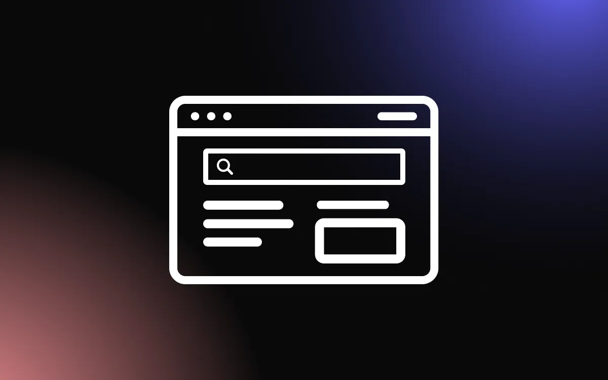
Navigation
A clean, intuitive navigation system is key to an effective homepage. It’s the roadmap that guides users through your website, helping them find the information they’re looking for without unnecessary clicks or scrolling.
The easier it is for users to navigate your site, the more likely they are to stay, explore, and engage with your content. Your main menu should include links to your most important pages, and it should be easy to locate and use on all devices. Consider adding a search function for larger websites to enhance user experience further.
Call-to-Action (CTA)
CTAs are one of the most important elements of your homepage. They guide users towards the actions you want them to take, whether that’s signing up for a newsletter, making a purchase, or learning more about your products or services.
Effective CTAs are concise, action-oriented, and prominently placed. They often stand out visually from the rest of the page, drawing users’ attention and prompting action.
Content and Visuals
Visual content is a powerful tool in capturing user attention and enhancing engagement. High-quality images, engaging videos or animations, and informative infographics can all bring your homepage to life, making it more visually appealing and interactive.
Images can help humanize your brand, videos can provide an engaging overview of your products or services, and infographics can simplify complex information. Remember, your visuals should not only look great but also align with your branding and resonate with your target audience.
Social Proof
In an era of information overload, consumers often rely on the opinions and experiences of others to make decisions. By featuring customer reviews, testimonials, case studies, or client logos on your homepage, you provide social proof that can build credibility and trust with your audience.
This can reassure potential customers that others have had positive experiences with your company, nudging them towards choosing your products or services.
Note: Common Ninja offers a large selection of social proof widgets like the Testimonials widget and the various review widgets.
Contact Information and Footer
Your contact information should be easily accessible from your homepage. This not only enhances user experience but also encourages users to reach out with questions or feedback, potentially leading to increased conversions.
Your footer is another important component of your homepage. It’s an opportunity to provide additional navigation options, legal information, and social media links. A well-designed footer can improve user experience by providing a wealth of information in a compact, unobtrusive format.
Design Principles for an Engaging Homepage

Design principles are the guiding light that shapes your homepage. When applied strategically, they can elevate your homepage design from just aesthetically pleasing to both visually compelling and highly functional.
Consistent Branding
In the vast sea of websites, consistency in branding can be your lighthouse that guides users back to your brand time and again. Branding goes beyond a well-designed logo or a catchy tagline. It’s about weaving a consistent narrative through every element on your homepage, from the color palette to the tone of your copy, from the style of your images to the user interface elements. By doing so, you’ll create a familiar and memorable experience for your users that reinforces your brand identity and builds trust.
Clarity and Simplicity
Here’s something we often forget – sometimes, less is more. In an era where users are bombarded with information, a clear and simple homepage design can be a breath of fresh air. Aim for clear, concise messaging that communicates your value proposition effectively.
Keep your design clean and intuitive, avoiding unnecessary clutter that could distract or confuse your users. Ensure your navigation is easy to understand, enabling users to find what they need without a struggle.
Responsive Design
We’re in the age of digital mobility, where accessing websites from different devices is the norm. Thus, responsive design is no longer a luxury, but a necessity. A responsive homepage adjusts its layout and elements based on the user’s device, providing an optimal viewing and interaction experience whether they’re on a desktop, a tablet, or a smartphone.
By embracing responsive design, you’re prioritizing user experience across all devices, potentially expanding your reach and engagement.
Visual Hierarchy and Layout
Visual hierarchy is the art and science of organizing design elements in order of their importance. It directs the user’s eye to what matters most, then second most, and so on. This can be achieved using color, size, contrast, and placement.
Combine visual hierarchy with a logical layout, where related elements are grouped and sequenced in a way that makes sense. Together, they create a roadmap for the user’s eyes, guiding them effortlessly through your content.
Use of Colors and Typography
The colors and typography you choose for your homepage have a profound impact on its overall look and feel, as well as its readability. Pick a color scheme that aligns with your brand, sets the right mood, and offers enough contrast for text to be easily readable.
Select fonts that not only look good but are also easy to read and evoke the right emotions. Remember, the goal is to create a harmonious and pleasing experience that draws users in and keeps them engaged.
Best Practices for Homepage Design

Creating a fantastic homepage is like mastering a recipe, it comes with time, patience, and a few secret ingredients. Here are some best practices that can take your homepage design to the next level:
Prioritizing Above-the-Fold Content
The “above the fold” concept comes from the newspaper industry and refers to the content that’s visible on the screen without scrolling.
This space is prime real estate on your homepage, so make it count. It should contain your most important elements, such as your value proposition, primary CTA, and compelling visuals. Make sure what you place here grabs attention and entices users to scroll down for more.
Keeping the Design Uncluttered
An effective homepage isn’t about cramming in as much information as possible. It’s about carefully curating content and presenting it in a clean, organized way.
An uncluttered design not only looks more professional, but it also improves usability and allows your most important elements to shine. Make use of white space, a powerful design element that helps separate content and increase readability.
Optimize for Speed
In our fast-paced digital world, speed matters. A slow-loading homepage can frustrate users and lead to high bounce rates. Optimizing for speed is, therefore, crucial.
This can involve compressing your images, minimizing the use of heavy scripts, implementing lazy loading, and using a reliable hosting provider. Faster load times can significantly enhance user experience and improve your SEO ranking.
Regular Updates and Freshness
Just like a store window display, your homepage should keep changing to stay fresh and interesting. Regularly update your content to reflect your latest offerings, news, or updates. This can give users a reason to come back and also signal to search engines that your site is active and up-to-date.
Analyzing and Improving Homepage Design

Designing a homepage is much like embarking on an adventure; the journey doesn’t end just because you’ve launched your page. It’s a quest of constant discovery, testing, learning, and refining, and it’s never quite finished. Let’s explore the path to this never-ending journey:
User Testing
User testing offers a direct window into how real users interact with your homepage. This can uncover usability issues, gaps in your content, and insights into user behavior that you may not have considered. You can conduct user testing in various ways, from one-on-one interviews to remote user testing using tools like UserTesting.
A/B Testing
A/B testing is a powerful method to understand what works best on your homepage. It involves creating two versions of an element (like a headline or CTA button), showing them to different segments of your audience, and seeing which performs better.
Using A/B testing tools, you can test everything from your layout and images to copy and colors, gradually refining your design based on data.
Analytics and User Behavior Data
Leverage tools like Google Analytics to track key metrics such as bounce rate, time on page, and conversion rate.
This can provide valuable insights into how well your homepage is performing and where there’s room for improvement. Consider using heatmaps and session recording tools to further understand user behavior and identify potential areas of friction.
Iterating on Your Homepage Design
Once you’ve gathered valuable insights from your tests and analytics, it’s time to roll up your sleeves and start tweaking your homepage design. This could be as simple as reworking your copy, swapping out images, or rearranging your layout.
But sometimes, it might involve shaking things up with a major overhaul. The key is to remember that improving your homepage isn’t a one-and-done task; it’s more like an open-ended conversation with your users, constantly learning from them and refining your design.
Examples of Successful Homepage Designs
Just to make sure all this theory isn’t going over your head, how about we take a little virtual tour? Picture this as our interactive field trip, where we will visit some businesses that have aced the homework of implementing these design principles and elements. Let’s get a real feel for this, shall we?
Dropbox

Dropbox’s homepage is a masterclass in simplicity and clarity. With its clean design and minimalistic approach, it doesn’t take much time for visitors to grasp what Dropbox offers. The call to action is unmistakably clear, and the navigation is both intuitive and uncluttered. The use of whitespace gives the site a breathable layout, contributing to a pleasing user experience. Dropbox’s homepage exhibits how simplicity can drive user engagement and promote the brand’s services effectively.
Apple

When you land on Apple’s homepage, it’s like stepping into an artfully curated digital gallery. This homepage reflects Apple’s ethos of simplicity, elegance, and cutting-edge design, much like their array of products. With bold, high-quality images that feel like they’re leaping off the screen, it’s hard not to be enticed by their product showcase.
And the navigation? It’s as streamlined and intuitive as using one of their devices. Headers are concise and clear, gently guiding you through their digital landscape. By marrying striking visuals with user-friendly navigation, Apple’s homepage isn’t just a platform for their products, it’s an embodiment of their design philosophy. It’s a testament to how a homepage can encapsulate the spirit of a brand, while also making the user journey a breeze.
Medium

Medium’s homepage does an excellent job of providing a clear snapshot of the platform’s diverse content offerings. Articles are smartly categorized, and the design makes it easy for users to navigate through different topics or stories of interest.
The use of clear and bold typography enhances readability, which is a crucial aspect for a content-rich site like Medium. The homepage design focuses on putting content front and center, and yet, it doesn’t feel overwhelming, which is a remarkable balance achieved through good design principles.
Spotify

Spotify’s homepage design effectively captures its brand personality – vibrant, dynamic, and user-centric. The use of bold, eye-catching imagery combined with straightforward text offers visitors an immediate understanding of what Spotify offers.
The homepage also provides easy access to various sections like Premium, Support, and Download, enhancing the user experience. In essence, Spotify’s homepage is visually appealing and user-friendly, promoting its services in an engaging and clear manner.
Evernote

Evernote’s homepage design is geared towards demonstrating the product’s value proposition efficiently. The concise explanatory text, combined with representative visuals, gives visitors an immediate understanding of what Evernote does.
Its clear call-to-action buttons guide the user’s journey, and the uncluttered navigation makes for a user-friendly experience. Evernote’s homepage showcases how a product-focused design can effectively communicate the brand’s offering to its users.
Conclusion
Designing a homepage that leaves a lasting impression involves a delicate balance of science and art. It requires a deep understanding of your audience, meticulous crafting of key elements, and adherence to design principles that prioritize user experience. But the journey doesn’t end there.
Your homepage should be a dynamic entity, evolving based on user feedback, performance data, and changing business needs. It’s a continuous journey of testing, learning, and optimizing to keep your users engaged and achieve your business goals.