


Diverse Magnifier Options for Your Needs
The Image Magnifier widget offers an array of magnifier styles, allowing you to select the one that best meets your requirements.
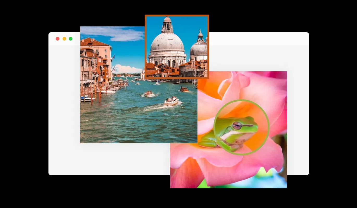
With the W3Schools Spaces Image Magnifier widget, your audience can conveniently enlarge your photos. This not only amplifies their enjoyment but also empowers those with visual impairments to appreciate your images and make sense of the content on your W3Schools Spaces website more thoroughly.
The W3Schools Spaces Image Magnifier widget is a compelling instrument for driving sales on e-commerce website. Allowing clients to view your items in higher resolution increases the likelihood of them making a purchase.
By incorporating the Image Magnifier for W3Schools Spaces, you can turn bland pages into lively and immersive experiences on your W3Schools Spaces website. Adding interactivity to images on your W3Schools Spaces website not only enhances user engagement but also adds a fun and dynamic element to your content.
The Image Magnifier widget offers an array of magnifier styles, allowing you to select the one that best meets your requirements.

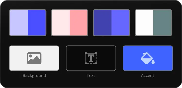
The Image Magnifier widget allows you to customize the magnifier for a more personalized look, enabling you to fit it to your brand’s design and the website’s aesthetics.
Make your Image magnifier for W3Schools Spaces your own by customizing its design features to your liking. You can create a custom look and feel by modifying the colors, fonts, spacing, and other design elements of this widget. The background color and text color can be changed, along with the color of the hover effects, so that your website will look and feel better. Another customization option is the ability to change the fonts. You can choose from a wide range of different fonts, to create a unique and visually striking design. It can be handy for businesses seeking to create a consistent brand identity online.

With a fully responsive W3Schools Spaces Image magnifier widget, you can give yourself a significant edge over your competitors in the mobile-first world we live in today. Mobile device optimization is increasingly important because more and more people access the internet through their smartphones and tablets. Image magnifier widget's responsive design ensures that it will automatically adjust to the device size and resolution it is being viewed on, providing a seamless and consistent user experience. If your users access your W3Schools Spaces website on a desktop computer, a tablet, or a smartphone, they will be able to view and interact with your Image magnifier for W3Schools Spaces.

As with all of Common Ninja's widgets, the Image magnifier for W3Schools Spaces also provides the option to add custom CSS, which allows you to take your customization to the next level and be even more creative. Custom CSS allows you to create styles and design elements not available through built-in customizations. With custom CSS, you can create unique and visually striking designs tailored to your specific needs. The use of custom CSS can also be used to create unique and engaging interactions and animations.

You can embed Image magnifier for W3Schools Spaces on website by copying and pasting a single line of code. If the widget is embedded, the Image magnifier and widget will automatically update when you make changes, so there is no need to manually update either. Using this feature, you'll always have the most recent and accurate version of your W3Schools Spaces Image magnifier.
