


Various Magnifier Types
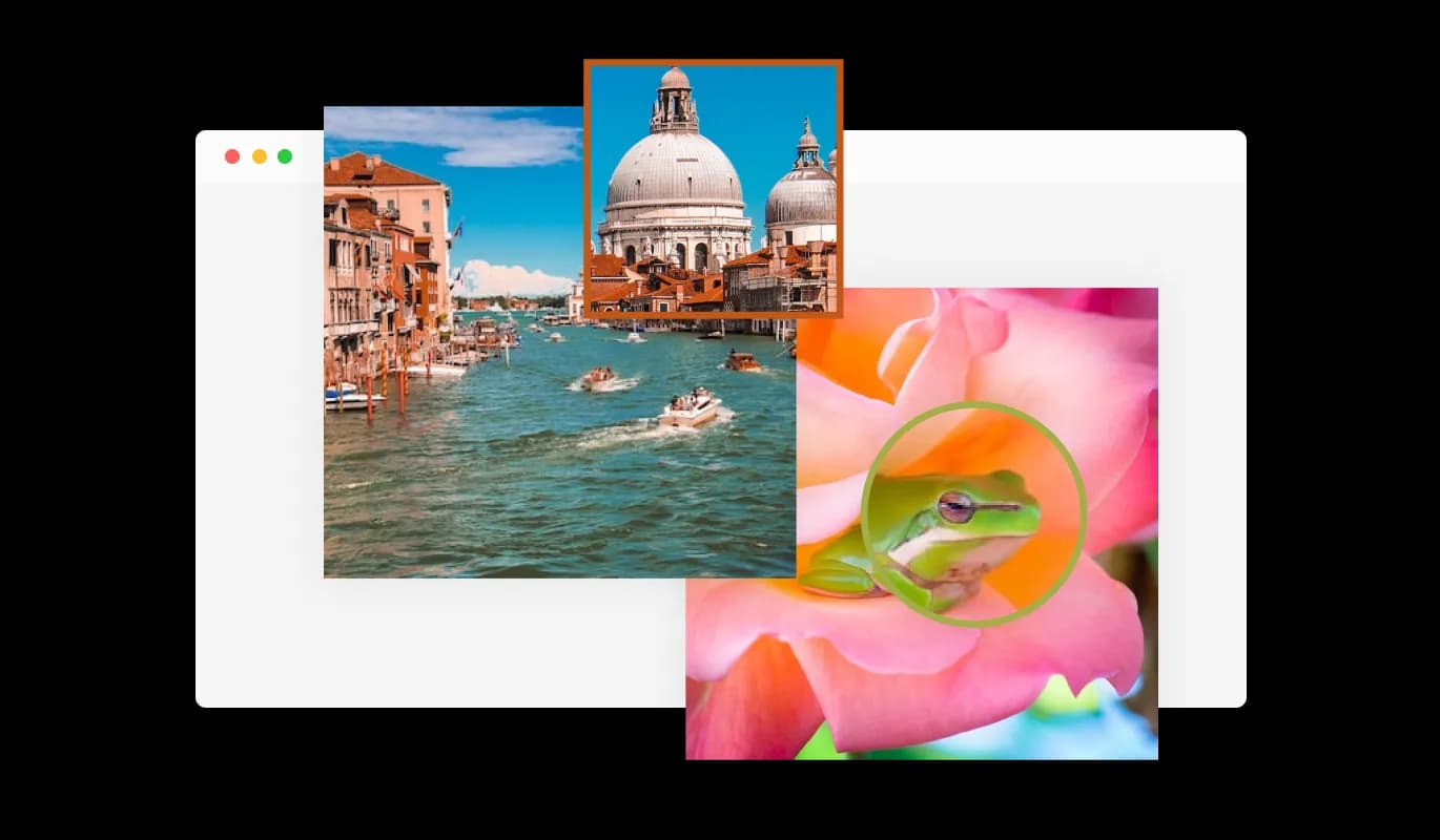
Featuring numerous magnifier designs, the Image Magnifier widget allows you to customize your experience according to your needs.
Utilizing the Pixnet Image Magnifier widget, your users can smoothly magnify your images. This not only amplifies their enjoyment but also empowers those with visual impairments to appreciate your images and make sense of the content on your Pixnet blog more thoroughly.
The Image Magnifier for Pixnet can be a powerful, sales-driving tool for e-commerce blog. As customers can observe your products in enhanced detail, they may be more persuaded to finalize a purchase.
Leverage the Image Magnifier for Pixnet to change monotonous pages into interactive and appealing encounters for visitors on your Pixnet blog. Introducing interactive functionality with images on your Pixnet blog fosters user engagement and adds an entertaining touch to your content.
Featuring numerous magnifier designs, the Image Magnifier widget allows you to customize your experience according to your needs.

The Image Magnifier widget allows you to customize the magnifier for a more personalized look, enabling you to fit it to your brand’s design and the website’s aesthetics.
The Image Magnifier for Pixnet offers complete customization possibilities so you may change the design to suit your requirements. With this widget, you can change the colors, fonts, spacing, and a wide range of other design elements to create a custom look and feel tailored to your specific requirements. The background color and text color can be changed, along with the color of the hover effects, so that your blog will look and feel better. Another customization option is the ability to change the fonts. You can choose from a wide range of different fonts, to create a unique and visually striking design. It can be handy for businesses seeking to create a consistent brand identity online.

The Pixnet Image magnifier widget is fully responsive and will look great on any device, this feature can give you a significant advantage over your competitors in today's mobile-first world. Mobile device optimization is increasingly important because more and more people access the internet through their smartphones and tablets. Image magnifier widget's responsive design ensures that it will automatically adjust to the device size and resolution it is being viewed on, providing a seamless and consistent user experience. If your users access your Pixnet blog on a desktop computer, a tablet, or a smartphone, they will be able to view and interact with your Image magnifier for Pixnet.

Similarly to all of Common Ninja's widgets, the Image magnifier for Pixnet allows for the addition of custom CSS, allowing for further customization. Custom CSS allows you to create styles and design elements not available through built-in customizations. You can create visually striking designs tailored to your needs using custom CSS. The use of custom CSS can also be used to create unique and engaging interactions and animations.

Copy and paste just one line of code into your blog's HTML to embed the Image magnifier for Pixnet. You won't have to manually update the Image magnifier widget every time you make a change once the widget is embedded. This feature can save you a lot of time and effort, and ensure that your Pixnet Image magnifier is always up-to-date and accurate.

The Image Magnifier widget offers a variety of magnifier types to choose from, allowing you to select the one that best fits your needs and preferences.
Yes, the Image Magnifier widget allows for easy customization of the magnifier, enabling you to personalize its appearance to align with your brand's design and your website's aesthetics.
The Image Magnifier widget features full customization options, allowing you to modify various elements such as colors, fonts, spacing, and more to achieve the desired look.
Yes, the Image Magnifier widget is fully responsive and designed to look great on any device, ensuring a positive user experience in a mobile-first world.
No, the Image Magnifier widget is easy to use and does not require any coding knowledge. The intuitive dashboard and drag-and-drop feature enable you to customize the widget with just a few simple clicks.
Yes, similar to other Common Ninja apps, you can add custom CSS to the Image Magnifier widget to enhance its appearance and achieve a more creative design.
Embedding the Image Magnifier widget on your website is simple. Just copy a single line of code and paste it into your website's HTML. The widget will automatically update with any changes you make within the customization dashboard.
Yes, you can easily do so from the “Templates” tab.
It’s simple. All you need to do is to sign up and start using the free version.
Common Ninja’s Image Magnifier widget is free to use. It is limited to a certain amount of views, however.
Common Ninja’s Image Magnifier widget is compatible with ALL current and future website builders.
Yes, the Image Magnifier widget is GDPR-compliant.
No. Using our Image Magnifier widget is very simple. The widget comes with an intuitive drag-and-drop interface and fully customizable options. Once you’ve finished editing the widget to your liking, all you need to do is copy the provided code and add it to your website.
Yes. We are eager to hear your request. Please visit our Feature Request page.
To install the Image Magnifier widget, simply copy the provided single line of code and paste it into your website's code. This straightforward process allows for easy integration of the widget into your site.
Yes, the Image Magnifier widget offers comprehensive customization options. You can adjust the colors, fonts, spacing, and other design elements to match your brand and website aesthetics. Additionally, you can use custom CSS for even more creative control.
Absolutely! The Image Magnifier widget is fully responsive, ensuring a flawless appearance and consistent user experience on any device, including smartphones and tablets.
Yes, the Image Magnifier widget features a selection of different magnifier types. This variety allows you to choose the best magnifier style to suit your needs and preferences.