Carousel Grid

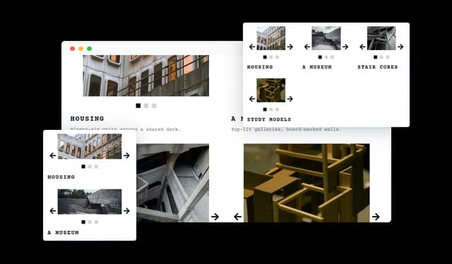
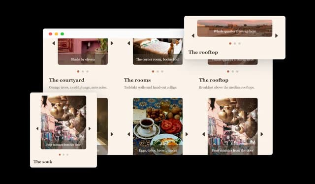
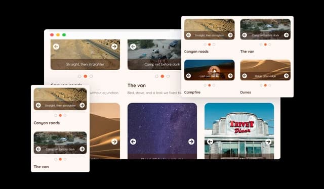
Display multiple image carousels together in one organized grid layout.

Create a Carousel Grid

loved by 500K+ businesses

plugineditoreditor

Why Should You Use the Carousel Grid Widget+?

Organize Several Collections in One Place

Group related images into separate carousels so categories, product lines, projects, or team members each get their own space inside a single widget.

Save Space on Busy Pages

Present a large number of images without a long scrolling gallery. Each carousel keeps its images in a compact frame that visitors browse at their own pace.

Give Every Collection Context

A title and a description sit under each carousel, so visitors know what they are looking at instead of guessing from the images alone.

Turn Images Into Entry Points

Every image can link somewhere. Send visitors from a carousel straight to a product page, an article, a portfolio piece, or any other page on your site.

Multiple Carousels in One Grid

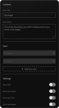
Build a grid out of independent carousels. Each cell holds its own set of images and moves on its own, so a single widget can present several collections instead of one long gallery. Cells can be reordered, hidden, or removed at any time.
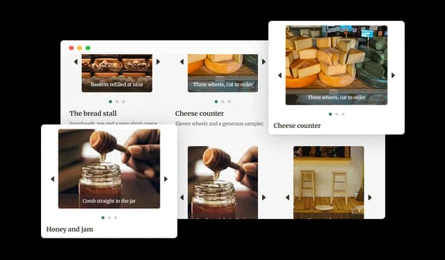
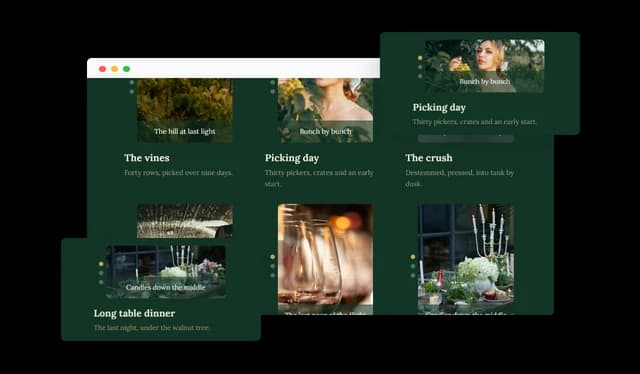
Carousel Grid - Multiple Carousels in One Grid

Individual Titles and Descriptions

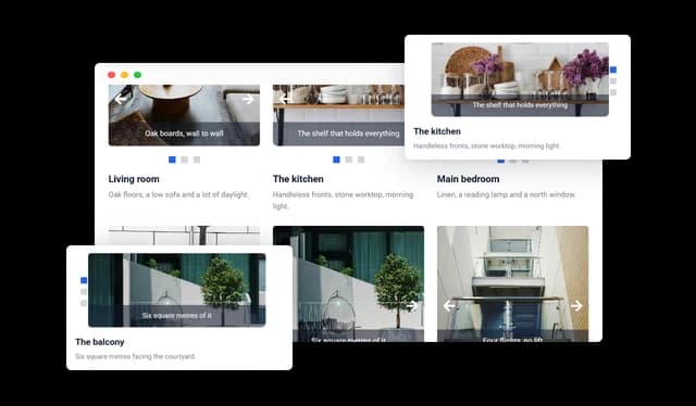
Every carousel has its own title and description, shown under its images. Both can be hidden across the whole grid, and their color and size are editable to match the rest of the page.

Carousel Grid - Individual Titles and Descriptions

Flexible Grid Layout

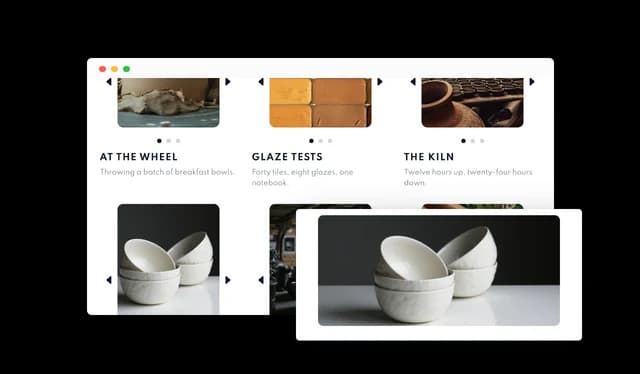
Set how many carousels appear in each row and how much space separates them. Column count and spacing can be adjusted separately for desktop, tablet, and mobile, so the grid stays readable on every screen.

Carousel Grid - Flexible Grid Layout

Custom Images, Captions, and Links

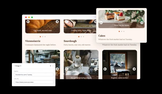
Add images one at a time or with bulk upload, then give each one a caption, alt text, and a link. Captions can sit above or below the image, with their own color and background.

Carousel Grid - Custom Images, Captions, and Links

Multiple Carousel Layouts

Choose between five carousel layouts. They control whether the arrows sit inside or outside the image, whether the next image peeks in from the side, and whether pagination runs under the carousel or down its left or right edge.

Carousel Grid - Multiple Carousel Layouts

Navigation Arrows and Pagination

Visitors move through each carousel with arrows and pagination you control. Seven arrow shapes are available, from chevrons and carets to circled arrows, and pagination can appear as dots, circles, squares, or image thumbnails. Colors, active colors, and pagination size are all editable.

Carousel Grid - Navigation Arrows and Pagination

Automatic Transitions and Random Order

Turn on auto transition and every carousel advances on its own, cycling continuously through its images, with both the transition speed and the time each image stays on screen adjustable. Random order shuffles each carousel's images so the grid looks a little different every time the page loads.

Carousel Grid - Automatic Transitions and Random Order

Image Popups

Carousel images can open in a larger popup view on the same page, so visitors can look closely at a product, a photograph, or a detail without leaving what they were reading.

Carousel Grid - Image Popups

Flexible Carousel Sizing

Set the carousel height and choose how images fill their frame, with cover, contain, or the image's own proportions. You can also show up to five images at once inside a single carousel, or let the widget size them automatically.

Carousel Grid - Flexible Carousel Sizing

Responsive Design

The grid adapts to the screen it is viewed on, and columns, spacing, and styling can be edited separately for desktop, tablet, and mobile. A three column grid on a desktop can become a single column on a phone without touching the content.

Carousel Grid - Responsive Design

Custom Styling and CSS

Fonts, colors, corner radius, spacing, captions, arrows, and pagination are all editable from the design panel. For anything beyond that, custom CSS lets you target any element in the widget.

Carousel Grid - Custom Styling and CSS

Easy to Embed on Any Website

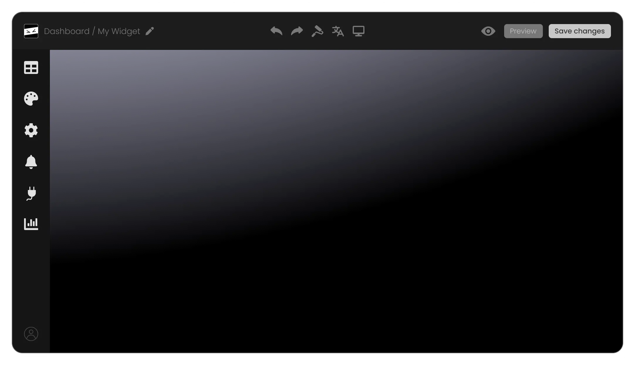
Copy one line of code and paste it into your page. The Carousel Grid works on any website builder or platform, and every change you make in the editor shows up on your site straight away, with no need to touch the embed code again.

Carousel Grid - Easy to Embed on Any Website

Compatible With All Site Builders, E-Commerce Platforms and Websites

View all supported platforms

FAQ

A Carousel Grid widget displays several image carousels together in one grid. Each cell of the grid is an independent carousel with its own images, title, and description, so a single widget can hold several separate collections.

A regular image carousel rotates one set of images inside a single frame. The Carousel Grid arranges several of those carousels in a grid, each with its own images and its own text, so visitors can browse multiple collections independently on the same page.

As many as your page needs. Each carousel is added as its own item in the editor, and each one can hold as many images as you want.

Yes. The number of columns and the space between carousels are both adjustable, and you can set them separately for desktop, tablet, and mobile.

Yes. Each carousel has a title and a description that appear under its images, and both can be hidden for the whole grid if you prefer images only.

Yes. Every image can carry a caption, positioned above or below the image, with its own text color and background color.

Yes. Each image has its own link field, so an image can send visitors to a product page, an article, or any other page. Images can also carry alt text for accessibility and SEO.

Only if you want them to. With auto transition turned on, each carousel cycles through its images continuously, and you control both the transition speed and the time each image stays on screen. With it off, visitors move through the images themselves.

Between one and five, or automatic, which fits the number of images to the width of the cell.

Yes. Carousel height is set in the design panel, and an image fit option decides whether images cover the frame, fit inside it, or keep their own proportions.

Yes. There are seven arrow styles and a color of your choice, and pagination can be shown as dots, circles, squares, or image thumbnails, with editable size and colors. Where the arrows and pagination sit is set by the carousel layout you pick.

Yes. The grid adapts to the screen it is viewed on, and columns, spacing, and styling can be edited separately for desktop, tablet, and mobile.

Yes. Colors, fonts, spacing, corner radius, captions, arrows, and pagination are all editable from the design panel, and custom CSS is available for anything beyond the built-in options.