Common Ninja has amazing no-code widgets that would beautify a website built on any builder. It is very easy to use and customise. It has as many widgets for almost everyone willing to make their website impressive.


Try the editor, no signup
Pick a template, customize it, and watch it update live, no signup.
No credit card · Free forever plan
The Common Ninja Ratio widget is a free, no-code tool for building icon-based infographics on any website. Choose an icon, set the proportions, and paste one line of embed code.
It draws the chart type where a row of small figures stands in for a whole and some of them are filled to show a share: three in ten, seven out of eight, four fifths. The form is also known as a pictograph or isotype chart.
Icons, groups, colours, animation, and interactive tooltips are all adjustable, plus custom CSS. Works on 200+ platforms including WordPress, Wix, Shopify, Squarespace, and Webflow.
Seventy percent is an abstraction. Seven filled figures out of ten is something a reader takes in at a glance without doing arithmetic, which is why the form has been used in public information design for a century.
A pie chart with two slices is a lot of geometry for a single fact, and a bar chart with one bar looks unfinished. An icon row carries one proportion cleanly, which is usually what a marketing page actually has.
Charities, research groups, and sustainability teams all publish proportions that need to land emotionally as well as accurately. Icons carry that weight where a table of percentages does not.
The usual alternative is an infographic exported as an image, which means going back to whoever made it every time a figure updates. Here the numbers are settings, so a refresh is a two-minute edit.
Choose an icon that represents what you are counting, people, buildings, trees, or anything else, then set how many there are in total and how many are filled. That is the whole chart.
Use groups to compare two or three proportions side by side, and add tooltips so hovering an icon explains the number behind it. The tooltip is where the precise figure goes, keeping the graphic itself clean.
Copy the snippet from the Add to Website tab and paste it where the infographic belongs. Updating the numbers later pushes to every page carrying the embed.
Icons scale and arrange themselves so a row of ten or a block of a hundred stays readable rather than turning into visual noise at small sizes.
Show several proportions side by side as separate groups, each with its own icon and colour, so two populations or two years can be compared in one graphic.
Icons can fill in as the graphic comes into view, and hovering one shows the exact figure. That keeps the visual simple while the precise number stays one interaction away.
The layout reflows to the screen width so a wide icon row does not overflow a phone, and a custom CSS field handles exact colours and spacing. One embed snippet, 200+ platforms.

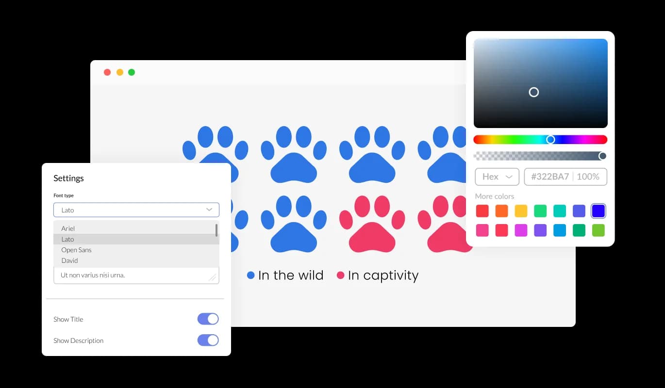
Experience enhanced control and customization with the Ratio Widget's Group Information setting. Website owners can assign specific information to each group, including selecting unique icons, adjusting icon colors, and adding titles. This feature ensures each group is distinct and aligns with the intended message and aesthetic, offering a tailored infographic experience to every visitor.
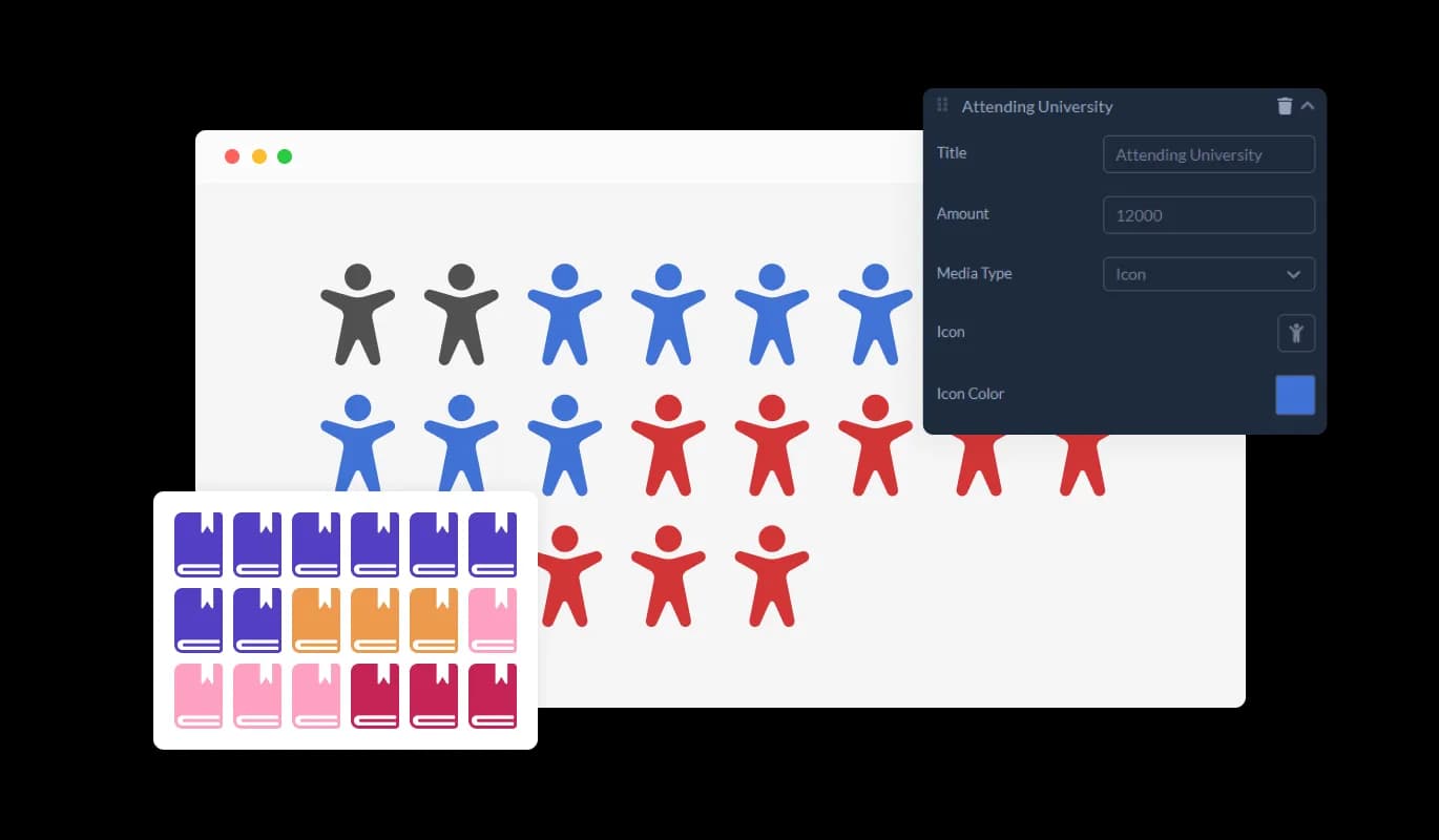
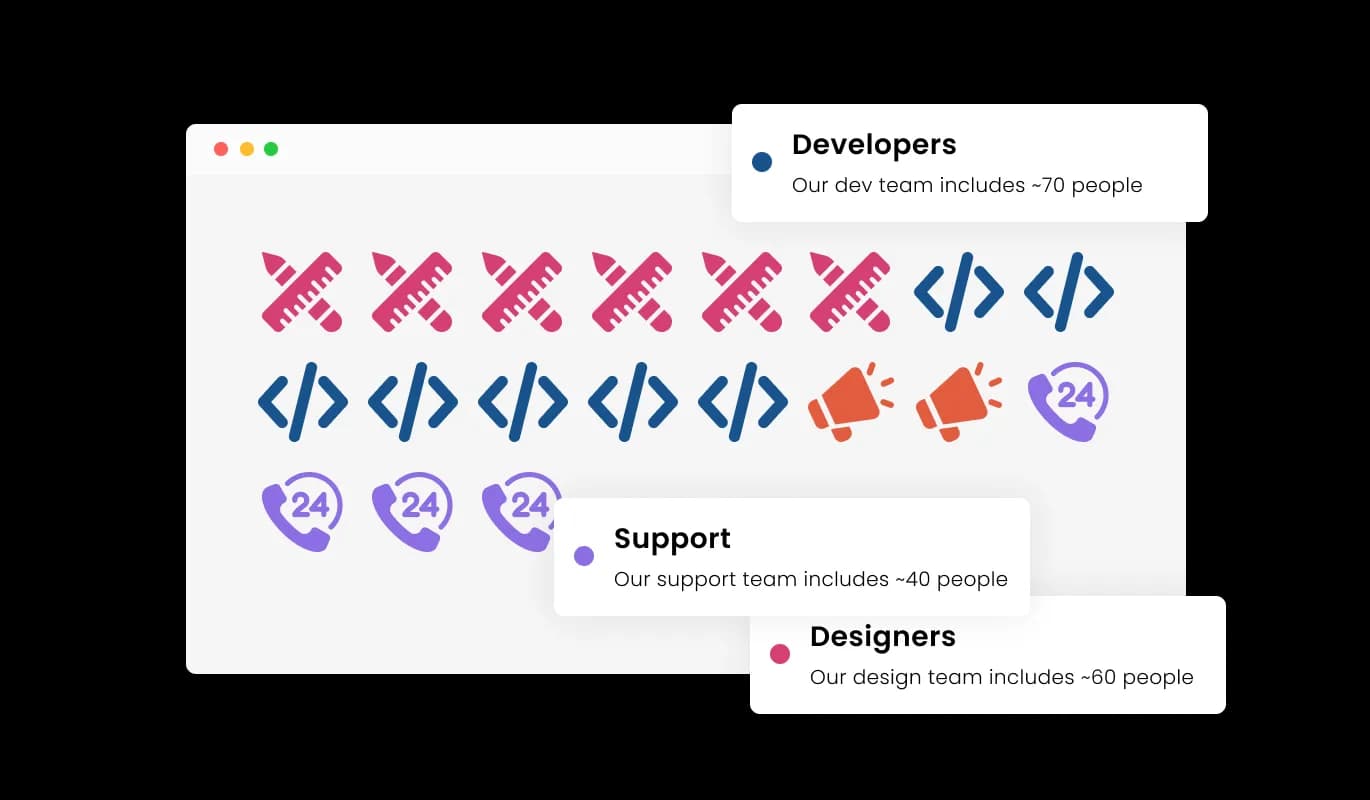
The Ratio Widget enriches user interaction with its Tooltip Description feature. As visitors hover over each group, a dynamic tooltip emerges, displaying content that’s tailored based on the group count. This interactive element not only enhances user engagement but also provides additional insights, making the exploration of your infographic both an informative and engaging experience.

With the Ratio Widget, total customization is at your fingertips. This feature allows site owners to manipulate every aspect of the ratio infographics, from icons to display style, ensuring it aligns precisely with their preferences and brand identity. Every infographic created is a true reflection of the website’s character, achieving a harmonized look and feel.

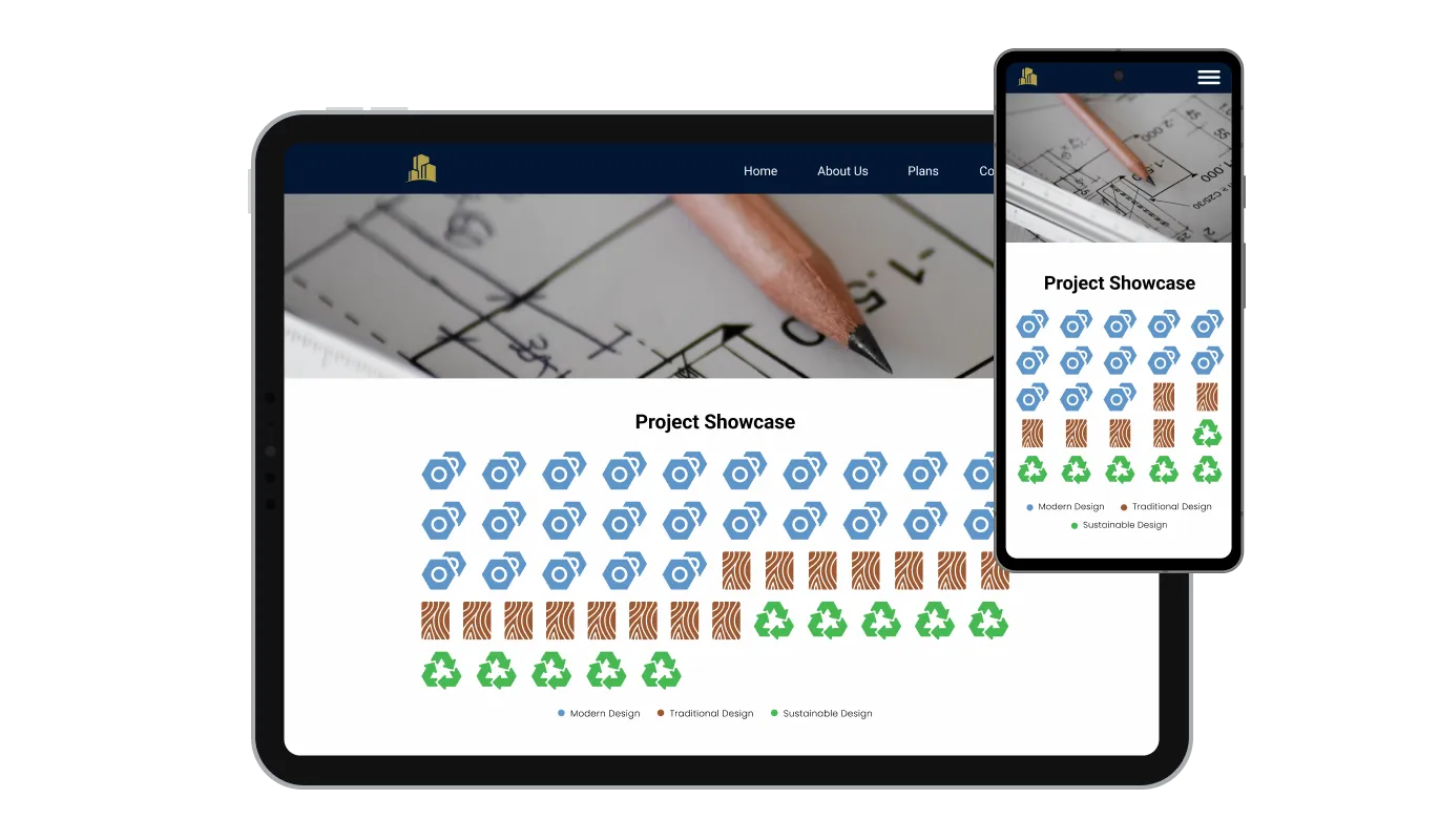
The Ratio Widget is crafted with a responsive design, ensuring your infographic ratios are displayed seamlessly on various devices, from mobile phones and tablets to desktop computers. Each icon and piece of information is adjusted to fit and function perfectly, offering a consistent and optimal viewing experience to all visitors.

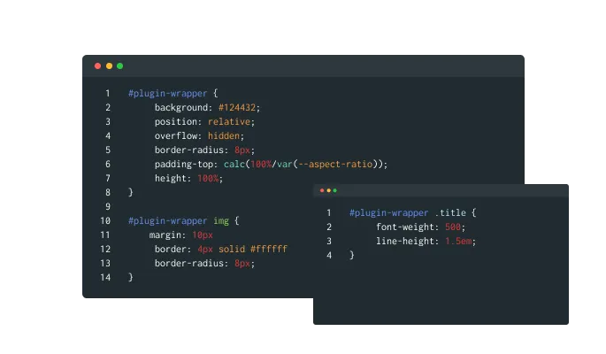
The Ratio Widget is adaptable for those well-versed in coding, offering support for custom CSS. This allows users with advanced technical skills to have precise control over the appearance and behaviour of the ratio infographics, ensuring a bespoke visual representation that aligns with specific needs and aesthetics.

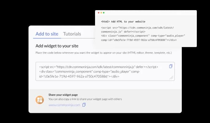
Embedding the Ratio Widget is a straightforward process, requiring only a single line of code to integrate it into any website. This simplicity ensures that site owners, regardless of their technical proficiency, can effortlessly enhance their webpages with informative and engaging ratio infographics.
The Ratio Widget introduces a smart, Automatic Ratio Calculation feature that optimizes the display of icons on your webpage. Users can set a maximum number of icons to be shown, ensuring the webpage remains uncluttered. The widget adeptly calculates and adjusts the quantity of icons for each group, based on the specific ratios, delivering a concise, yet comprehensive visual representation of data.
The Ratio Widget enhances data presentation through its animated infographic feature. Icons unveil sequentially, employing a typewriter effect, which ensures visitors are captivated. This progressive revelation of information not only captivates attention but also facilitates an easier understanding of the data shared, making each piece of information stand out distinctively.
Navigating and customizing infographics is a breeze with the Ratio Widget’s user-friendly interface. It’s designed to be straightforward and intuitive, empowering site owners to effortlessly create and tailor their ratio infographics. Even without advanced technical skills, users can seamlessly integrate and manage this feature on their websites.
Build your icon infographic in the editor
Open the editorFree to use · No credit card · No signup to try it
Common Ninja has amazing no-code widgets that would beautify a website built on any builder. It is very easy to use and customise. It has as many widgets for almost everyone willing to make their website impressive.
Outstanding service. I use their widgets to help me with my web design business and whenever I need help they are very quick to help.
Excellent company with excellent service!!! We used it to build a survey, it was very user friendly. The service was perfect. Amit helped us with every problem and question we had, thank you very much!!!
Common Ninja saved the day when building our website and the customer service Daniel, the co-founder and CEO, provided was amazing.
No, and the name is genuinely misleading, so it is worth saying first. This widget does not calculate aspect ratios, screen ratios, gear ratios, or financial ratios. It draws icon-based infographics: a row of small figures where some are filled in to show a proportion, like three in ten. If you came here for an aspect ratio tool, this is not it.
A pictograph, or an isotype chart. It represents a quantity with repeated icons rather than with the length of a bar or the angle of a pie slice, and it is the standard way to make a proportion legible to a general audience rather than to an analyst.
When you have one proportion and a general audience. A single figure like seventy percent looks thin as a bar chart and overwrought as a pie, but reads immediately as seven filled figures out of ten. Use bars when you are comparing many values, and use this when you are making one number land.
Yes, using groups. Each group has its own icon and colour, so you can put two populations or two years next to each other. Keep it to a handful, though: this form is about clarity, and six groups of icons is harder to read than a simple bar chart would be.
In the tooltip. Hovering an icon shows the precise figure, which keeps the graphic itself uncluttered while the detail stays available to anyone who wants it. It is also worth writing the number in the surrounding text, since tooltips do not exist for someone skimming.
A fill animation as the graphic scrolls into view helps, because it draws the eye and makes the proportion register as it builds. Keep it brief. An infographic that is still animating when the reader has moved on has cost you the moment it was meant to create.
That is on you rather than on the widget, and it matters. A proportion presented as an infographic looks authoritative whether or not it is sourced, so put the source in the text near the graphic. An unsourced statistic in a nicely drawn chart is still an unsourced statistic.
Yes, the layout reflows to the screen width. Check a wide icon row at phone width, because a hundred icons across a desktop band can become an unreadable speckle on a narrow screen; fewer icons representing larger units usually reads better there.
Pick your platform. Each takes under 4 minutes.

Visualize data and information using various chart types, including bar, pie, and line graphs, and more

Showcase progress and completion using animated fill-up bars

Showcase statistics, metrics, or countdowns in an animated visually appealing display

Showcase progress and completion using animated fill-up circels

Displays data or features side-by-side, allowing users to compare and contrast the information easily

Show events or important moments in the order they occurred, using pictures and text
The Ratio Widget is a tool that allows website owners to create and embed engaging ratio infographics on their websites, making complex information visually appealing and easily understandable.
It transforms numerical and categorical data into visually appealing and easily digestible infographics, enhancing user engagement and the overall aesthetic of the website.
Absolutely, the Ratio Widget is designed to adapt to various screen sizes, ensuring optimal display and functionality on mobile phones, tablets, and desktop computers.
No, the Ratio Widget features a user-friendly interface for easy creation and customization of infographics. However, users with coding knowledge can use custom CSS for advanced customization.
Users can customize icons, colors, titles, and more through the intuitive interface. For advanced customization, the widget supports custom CSS.
Yes, the Ratio Widget calculates the number of icons to display for each group based on set ratios, ensuring an uncluttered and effective visual representation.
Certainly, visitors can hover over each group to display a dynamic tooltip with content tailored based on the group count, enhancing user engagement and information transfer.
The widget can be easily embedded with just a single line of code, making the integration process simple and hassle-free for site owners of all skill levels.
Yes, users can set a maximum number of icons to ensure the infographics fit perfectly within the designated webpage space while maintaining clarity and appeal.
When visitors hover over each group in the infographic, a tooltip emerges displaying dynamic content based on the group count, offering additional insights and engagement.
es, the Group Information feature allows you to assign specific icons, adjust icon colors, and add titles to each group for customized visual representation.
Icons are unveiled one after another in a typewriter effect, making the presentation of information more engaging and aiding in the step-by-step revelation of data.
Engaging infographics can increase user interaction and time spent on the site, which can potentially improve SEO performance by reducing bounce rates and increasing user engagement.
The widget is designed to be compatible with the most commonly used browsers to ensure a consistent and efficient performance for a wide range of users. Please check the product specifications for detailed compatibility information.
We prioritize data security and privacy. The Ratio Widget operates with the latest security standards, ensuring that all data inputs and customizations are securely managed. For more detailed information about our data policies and practices, please refer to our privacy policy and terms of use.
Show a proportion as a row of icons rather than a bar or a pie, with group comparisons, fill animation, interactive tooltips, full responsiveness, and custom CSS. Numbers are settings, so updating a figure takes two minutes and no designer. Embed on 200+ platforms including WordPress, Wix, Shopify, Squarespace, and Webflow.
Create your icon infographicFree to use · No credit card · No coding