


Multiple Before & After Comparisons
Add multiple before and after image pairs and present them together in a single carousel. Each comparison can have its own images, labels, caption, starting position, dimensions, badge, and individual settings.
Present multiple before & after examples inside one organized carousel instead of filling the page with separate comparison sections. Visitors can explore more examples while the page remains clean, compact, and easy to browse.
Let visitors interact directly with each transformation instead of asking them to compare separate images. The draggable reveal makes differences easier to notice and helps communicate results clearly.
Show real examples of improvements, restorations, redesigns, treatments, or other transformations. Giving visitors control over the comparison makes visual results easier to evaluate and can help strengthen confidence in your work.
Add multiple before and after image pairs and present them together in a single carousel. Each comparison can have its own images, labels, caption, starting position, dimensions, badge, and individual settings.

Let visitors reveal the difference between images by dragging the comparison handle or clicking directly on the image. You can also display handler arrows and interaction hints to make it clear that each comparison is interactive.
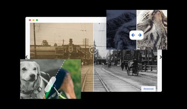
Choose the reveal direction that best suits each image pair. The Before & After Carousel supports horizontal, vertical, angle-right, and angle-left comparisons, along with control over the divider's initial position.

Choose from five carousel layouts and control the carousel width, spacing between items, and number of comparisons shown at once. This makes it easy to adapt the carousel to different page layouts and types of visual content.

Give visitors different ways to move through your comparisons. Customize navigation arrows and choose between dots, circles, squares, or thumbnails for pagination, with additional control over their position, size, and appearance.

Enable autoplay to move through comparison slides automatically and control how long each slide remains visible and how quickly transitions occur. You can also randomize the order of comparisons when you want visitors to see a different sequence.
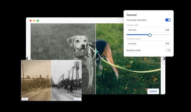
Add custom before and after labels, captions, and optional badges to individual comparisons. Labels can be positioned in different areas and set to remain visible, appear on hover, or stay hidden.

Choose from a range of square, portrait, landscape, and widescreen aspect ratios to suit different images. Full-screen viewing can also be enabled so visitors can inspect visual details and transformations more closely.

Customize colors, typography, backgrounds, handles, labels, navigation, pagination, badges, spacing, and other visual elements. This gives you the flexibility to match the Before & After Carousel to the design and branding of your website.
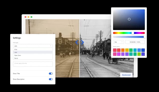
The Before & After Carousel adapts to desktop, tablet, and mobile screens for a consistent comparison experience across devices. It also supports both left-to-right and right-to-left layouts.
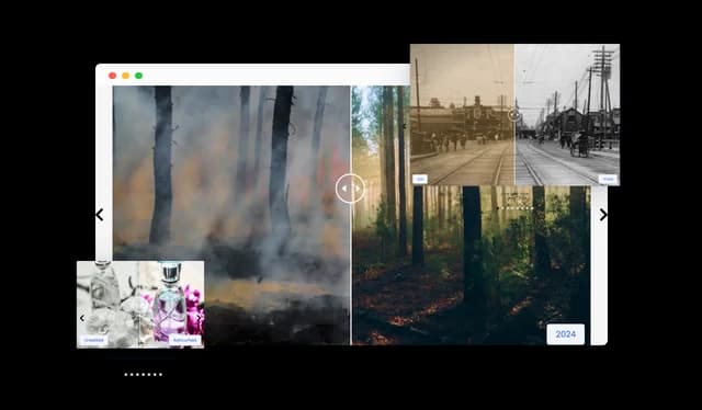
Add the Before & After Carousel to virtually any website using the provided embed code. It works with popular website builders, CMS platforms, e-commerce platforms, and custom websites without requiring coding knowledge.

Use custom CSS to customize the Before & After Carousel beyond the standard design controls. Developers and advanced users can fine-tune the styling to better match an existing website or design system.

A Before & After Carousel is an interactive image comparison tool that combines multiple before and after image pairs inside one carousel. Visitors can browse between different comparisons and interact with each one to reveal the visual differences between the two images.
A Before & After Slider focuses on comparing a single pair of images. A Before & After Carousel combines multiple interactive comparisons into one browsable carousel, making it easier to showcase several projects, transformations, or examples in the same section.
Yes. You can add multiple comparison items to the carousel, with a separate before image and after image for each one.
Yes. Visitors can drag the comparison handle to control how much of the before and after image is visible. Click-to-slide interaction can also be enabled.
Yes. Comparisons can use horizontal or vertical reveal directions. Angled reveal directions are also available for more creative layouts.
Yes. Individual comparison items can have their own images, labels, caption, starting divider position, reveal direction, dimensions, badge, and styling.
Yes. You can control the number of comparison items displayed within the carousel, along with their spacing and the overall carousel width.
Yes. Autoplay can be enabled, and you can control both the amount of time each slide remains visible and the transition speed between slides.
Yes. The carousel supports navigation arrows and several pagination styles, including dots, circles, squares, and thumbnails. Their appearance and position can also be customized.
Yes. Thumbnail pagination can give visitors a visual preview of the available comparisons and help them move directly to a specific item.
Yes. Each comparison can have custom labels for the two images. You can change the label text, choose their position, control when they appear, or hide them completely.
Yes. Each comparison can include a caption that provides additional context about the images or transformation being shown.
Yes. Full-screen viewing can be enabled so visitors can inspect images and transformation details more closely.
Yes. The carousel adapts to different screen sizes and is designed to work across desktop, tablet, and mobile devices.
The Before & After Carousel can be used for renovations, photography editing, restoration projects, beauty treatments, interior design, landscaping, product demonstrations, design revisions, portfolios, case studies, and other visual transformations.
No. The carousel can be created and customized using Common Ninja's no-code editor. Custom CSS is also available for users who want additional styling control.
Yes. The carousel can be embedded on popular website builders, content management systems, e-commerce platforms, and custom websites that support embed code.