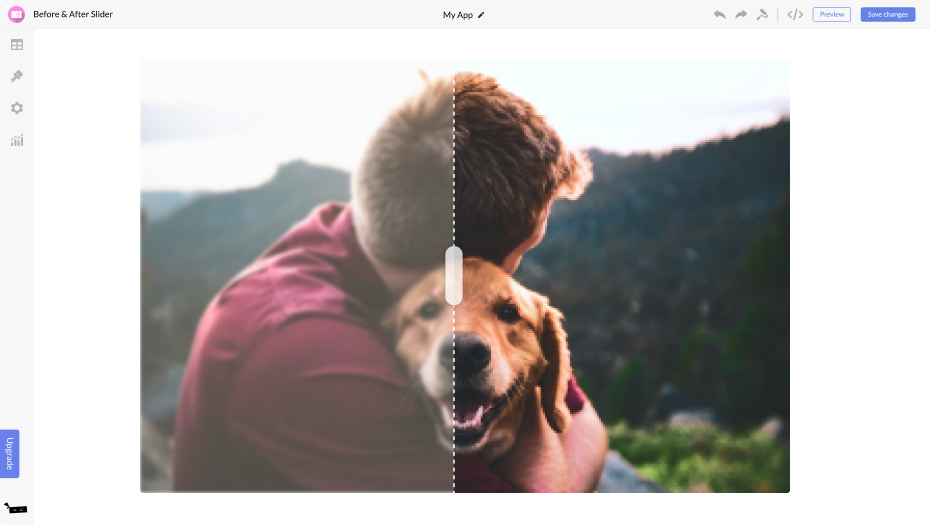
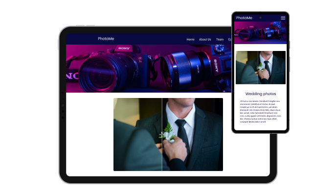
You might want to use a before and after slider widget on your website for several reasons.
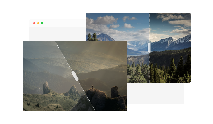
First, a before and after slider widget can be a useful way to showcase the results of your work or products. By displaying a before and after image in a slider format, you can clearly demonstrate the improvements or changes you have made and provide tangible evidence of the value your work or products can provide.
Second, using a before and after slider widget can help improve your website's user experience by making it more interactive and engaging. By allowing your visitors to compare the before and after images in the slider, you can provide a more immersive and interactive experience that can keep visitors on your site longer and encourage them to explore more.
Third, using a before and after slider widget can help improve your website's search engine optimization (SEO). By including relevant keywords and phrases in the text and links you add to your before, and after slider, you can improve the chances that your website will appear in search results for those terms. This can help drive more website traffic and increase your visibility online.
Overall, using a before and after slider widget on your website can be a useful way to showcase the results of your work or products, improve the user experience, and boost your website's SEO.


