


Verified review
Common Ninja has amazing no-code widgets that would beautify a website built on any builder. It is very easy to use and customise. It has as many widgets for almost everyone willing to make their website impressive.
Try the editor, no signup
Pick a template, customize it, and watch it update live, no signup.
No credit card · Free forever plan
No credit card · Free forever plan
The Common Ninja Charts & Graphs widget is a free, no-code data visualization tool for adding bar charts, line graphs, pie charts, donut charts, area charts, scatter plots, and radar charts to any website.
Import data manually, from a CSV file, or from a remote URL (including Google Drive); customize colors, fonts, tooltips, and animations; and paste one line of embed code on 200+ platforms including Webflow, Framer, Squarespace, Notion, and Wix.
Drop several charts on one page to ship a public dashboard for your team, board, or community. KPI tiles, trend lines, share-of-total donuts, and category bars sit together on a single embed and refresh from your data source automatically.
Upload a CSV file directly or point the widget at any remote URL, including a CSV stored on Google Drive or Dropbox. Prepare data in the tool you already use (Sheets, Excel, your analytics export) and connect it once. No data re-keying, no second source of truth.
Replace dense numeric tables with a chart visitors can read in a glance. Marketing reports, analytics summaries, commerce roll-ups, fundraising progress, and product roadmaps all communicate faster as a chart than as a paragraph of figures.
Pricing pages, comparison sections, and product breakdowns all convert better when a chart shows the trade-off visually. Visitors who see the shape of the data make decisions faster than visitors who scan a wall of numbers.
Start with bar, line, pie, donut, area, scatter, radar, polar, or bubble. Mix multiple chart types inside one widget if you need to compare data series side by side. Each chart type accepts the same data source, so switching mid-build keeps your data intact.
Type values directly into the editor, upload a CSV file, or point the widget at a remote URL (a CSV hosted on Google Drive, Dropbox, or any public endpoint). Prepare the data wherever you are most comfortable, then connect it once and reuse it across as many charts as you need.
Customize colors, fonts, tooltips, legend position, axis labels, and entry animations. Copy the embed snippet and paste it where the chart should render. Charts reflow responsively on mobile and update live as you edit them in the dashboard.
Bar, line, pie, donut, area, scatter, radar, polar, and bubble charts all live inside one widget. Switch types from the editor without re-entering your data. Combine multiple types inside a single chart (a bar + line combo for actual versus target, for example) when one shape isn't enough.
Upload a CSV file directly, point the widget at any remote URL (including a CSV hosted on Google Drive), or type values into the editor for ad-hoc charts. Prepare data wherever you already do it (Sheets, Excel, your analytics export) and the chart reflects what you connected.
Set colors per series, pick from web fonts, position the legend, label the axes, and toggle entry animations. Tooltips show on hover with the value, label, and any custom suffix you set. Tone the entire chart to match your brand palette without writing any CSS.
Charts reflow for the screen they render on. On mobile, long category labels rotate, the legend collapses below the chart, and tooltips switch to tap-to-show. No separate mobile chart to build; the same embed handles desktop, tablet, and phone visitors.
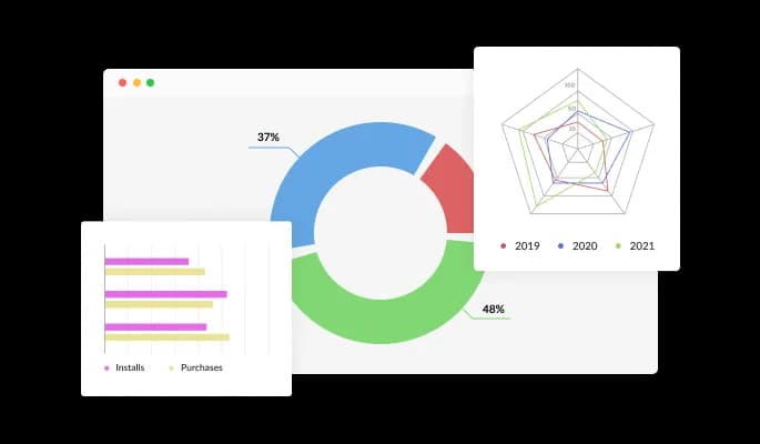
Charts & Graphs features 20 different types of charts that will enable you to deliver information just the way you want it to. From bar charts to pie charts, radial charts, and 3D charts. It’s got it all. Simply choose the chart you want and start using it, or customize it endlessly. It’s a fun game in its own right!
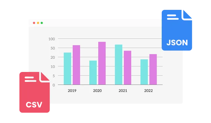
With the Chart & Graphs widget, you can convert any CSV file into an interactive chart or easily connect it to your Google Drive or other, remote URLs. Prepare the data wherever you are most comfortable doing it, and then upload it.
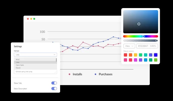
The Charts & Graphs widget comes with full customization options, giving you the ability to easily edit the design to match the aesthetic of your website. You can change the colors, buttons, and labels to match your branding. You can also choose from different font options and adjust the font size, style, and color to create a cohesive and professional look. In addition to these design options, you can customize the widget's spacing to ensure it fits seamlessly into your website layout.
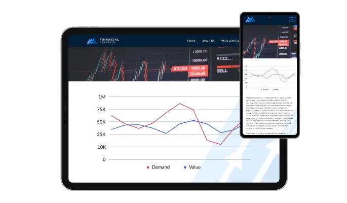
The Charts & Graphs widget is a valuable tool for any website. Not only is it fully responsive, meaning it will adjust seamlessly to fit the screen size of any device, but it also has a sleek and modern design that will enhance the overall look of your site. In a world where more and more people are accessing the internet through their phones and tablets, it is crucial to have a website that is optimized for mobile viewing. The Charts & Graphs widget will allow you to do just that, giving you an edge over competitors.
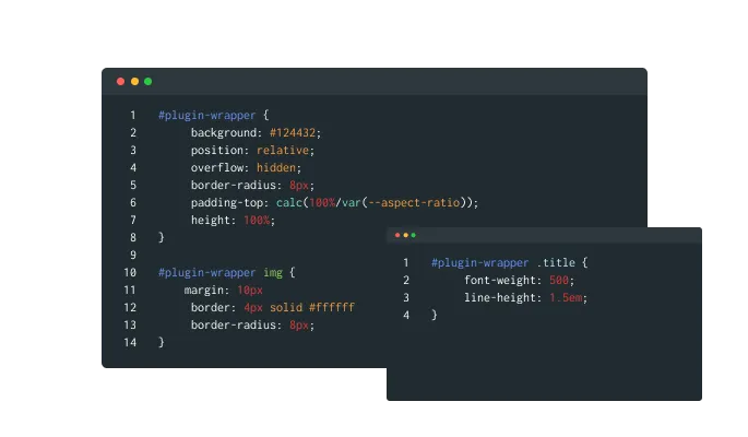
Our advanced editor is a powerful tool that gives you complete control over the appearance of the Charts & Graphs widget. With this feature, you can easily customize every aspect of the widget's look and feel, from the colors and fonts to the layout and positioning. But if you're feeling particularly creative, you can take your customization to the next level by editing the CSS directly. This gives you the ability to make even more advanced changes to the widget, allowing you to make it your own. Whether you want to make a few simple tweaks or go all out with advanced customizations, our advanced editor has you covered.
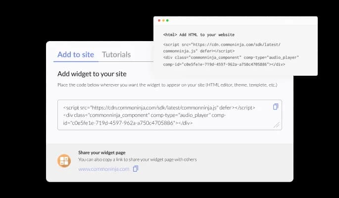
To embed the Charts & Graphs widget on your website, simply copy and paste the provided code snippet into the HTML of your webpage. Additionally, the widget is designed to be self-updating, meaning that any changes you make to the Charts & Graphs Editor will be reflected automatically on your website without the need for any additional manual updates.
The Charts & Graphs widget is easy to use and requires no coding knowledge. Our intuitive dashboard with the drag-and-drop feature will enable you to customize the widget any way you’d like to with just a few simple clicks.
Enhance your graphs and charts by adding tooltips that provide additional information for your website. These tooltips can help clarify data points or provide context for your chart or graph, helping your users better understand and interpret the information you are presenting.
You have the option to define a color scheme that will be used as the default colors for your charts and graphs when they are automatically generated from an external source of data. By defining a color scheme, you can ensure that your charts and graphs have a cohesive and visually appealing appearance, even when they are being generated automatically.
Ready to publish your dashboard, report, or data chart?
Open the editorNo credit card · Setup in under 5 minutes
Common Ninja has amazing no-code widgets that would beautify a website built on any builder. It is very easy to use and customise. It has as many widgets for almost everyone willing to make their website impressive.
Outstanding service. I use their widgets to help me with my web design business and whenever I need help they are very quick to help.
Excellent company with excellent service!!! We used it to build a survey, it was very user friendly. The service was perfect.
Common Ninja saved the day when building our website and the customer service Daniel, the co-founder and CEO, provided was amazing.
Yes. The free plan covers one Charts & Graphs widget with no time limit, no credit card, and no trial countdown. Upload a CSV, point the widget at a remote URL, or type the data manually. Upgrade only when you need additional widgets, higher monthly view limits, or premium chart types.
Data charts. This widget renders bar, line, pie, donut, area, scatter, and radar charts from a data source like a Google Sheet or CSV. For tournament brackets, knockout-stage charts, or single- and double-elimination diagrams, use the Common Ninja March Madness Bracket Maker widget instead, which is built for match-up trees rather than data visualization.
No. This widget is built for data visualization (numerical values plotted as bars, lines, slices, or points), not for node-and-arrow diagrams. Flowcharts, org charts, and process diagrams need a dedicated diagramming tool. If your data is numerical and you want to show shape, comparison, or trend, this is the right widget.
Size charts are usually tabular (size, chest, waist, hip), not graphical, so the Common Ninja Comparison Tables widget is a better fit for that use case. If you want to show size distribution as a chart (visitors per size purchased, for example), this widget handles that directly with a bar or pie chart connected to your sales data.
Three options. Type values directly into the editor for quick or one-off charts. Upload a CSV file for larger data sets you have prepared in Sheets or Excel. Point the widget at a remote URL (including a CSV hosted on Google Drive or Dropbox) when you want to keep the data file in one place and reuse it across multiple charts.
Bar (vertical and horizontal), line, pie, donut, area, scatter, radar, polar, and bubble charts, plus combo charts that overlay a line on top of bars. Switch types from the editor without re-entering your data. Pick the type that best fits the shape of the story your data is telling.
In the Webflow designer, drag an Embed element onto the page where you want the chart. Paste the Common Ninja embed snippet into the Embed code field and click Save. Publish the site. The chart renders inline and refreshes automatically as you edit it in the Common Ninja dashboard.
Copy the Common Ninja embed link from the dashboard. On the Notion page, paste the link and choose Create Embed from the menu that appears. Resize the embed block to give the chart room. The chart runs inline on the page, including on a public-shared Notion page.
200+ platforms including Webflow, Framer, Squarespace, Notion, Wix, Shopify, WordPress, Elementor, Divi, Bubble, Carrd, Canva, Google Sites, Blogger, Ghost, Joomla, and any custom HTML page that accepts an embed snippet.
Pick your platform. Each takes under 4 minutes.
Displays data or features side-by-side, allowing users to compare and contrast the information easily

Displays pricing options for products or services in a clear and organized format
Showcase statistics, metrics, or countdowns in an animated visually appealing display
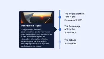
Show events or important moments in the order they occurred, using pictures and text

A simple slider that lets visitors compare before and after images to see visual changes clearly.
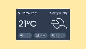
Show the current weather and forecast
Yes, the Charts & Graphs widget features a selection of 3d charts.
Yes, the Charts widget features an auto-refresh option.
Using the Charts & Graphs widget is very easy. Simply sign up and start using the free version. There's no need to worry about complicated setup or installation processes, as the Charts & Graphs widget is designed to be user-friendly and straightforward. Once you've signed up, you'll have access to all of the basic features and functions of the widget, which you can use to enhance your website and improve your online presence. From there, you can choose to upgrade to the paid version if you want to access more advanced features and capabilities. Regardless of which version you choose, you'll find that the widget is a powerful and easy-to-use tool that can help you take your online presence to the next level.
The Common Ninja Charts & Graphs widget is a free tool reach with features and options. While this widget is free to use, it does have a limit on the number of views it can handle. This means that after a certain number of views, the chat button may no longer be visible or functional on your website. It is important to note that this view limit may vary depending on the plan you are using. Despite this limitation, Common Ninja's Charts & Graphs is still a valuable tool for businesses looking to increase customer engagement and improve the overall user experience of their website.
The Common Ninja's Charts & Graphs widget is a versatile tool for any website builder. This means that you can easily add this widget to your website or store no matter what platform you use to build your website. The Charts & Graphs widget will work seamlessly with your platform whether you are using a popular website builder or something more specialized. This means you can enjoy all the benefits of this powerful tool without having to worry about compatibility issues.
It’s very easy to embed Common Ninja’s Charts & Graphs widget on your website and the process consists of two steps:
The Charts & Graphs widget is designed to comply with the General Data Protection Regulation (GDPR), a set of EU regulations protecting personal data and privacy. When using the Charts & Graphs widget, you can be confident that it will not collect or store personal data that could violate GDPR regulations. This ensures that your business is in compliance with these regulations and can protect your customers' data privacy. Overall, the Charts & Graphs widget is a secure and reliable tool that can be used to enhance your website without any concerns about GDPR compliance.
No need for coding skills. Our Charts & Graphs widget is designed to be easy to use, even for those with limited technical experience. The widget features a user-friendly interface that allows you to easily customize the widget without coding knowledge. You can fully customize the Charts & Graphs to match your branding. When you're done, simply copy the provided code and paste it into your website. It's that simple!
Embedding the Charts & Graphs widget on your website is a straightforward process. Simply copy the provided code and paste it into the desired location on your website. The widget will seamlessly integrate into your site, allowing you to take advantage of its features and functions. No technical expertise or programming knowledge is required - just copy and paste the code to get started. This simple process allows you to easily add the widget to your website and enhance its functionality without any hassle.
Yes. We are eager to hear your request. Please refer to this page.
Displaying charts and graphs on a website can have several benefits, including:
A charts and graphs widget is a pre-designed, interactive element that can be added to a website or application to display data in a visual format, such as a bar chart, line graph, pie chart, or scatter plot. Widgets are often created using JavaScript libraries or other web development tools, and they can be easily customized to display different types of data or to meet specific design requirements.
Charts and graphs widgets are often used to display data clearly and concisely, making it easier for users to understand and interpret the information. They can also be interactive, allowing users to hover over or click on different elements to display additional information or explore the data more deeply.
Using charts and graphs widgets can help improve the user experience on a website or application by making the data more accessible and engaging for users. They can also be helpful tool for presenting data professionally and visually appealingly, which can increase the credibility of the information being presented.
Bar, line, pie, donut, area, scatter, and radar charts. Upload a CSV or connect a remote data URL. Works on 200+ platforms including Webflow, Framer, Squarespace, Notion, and Wix.
Create your chartNo credit card · Setup in under 5 minutes